Monday, June 11, 2007
Sunday, June 10, 2007
ARCH 222 Final Board

Well, here it is folks. Unfortunately, the AAA printer didn't due the file colors and whites justice, but overall, I'm happy with it. You should notice the similarity between the scheme of this final and the presentation for studio, which I plan to post in a few minutes. I felt that black & white with emphasis on the water element was suitable, especially since the color of the materials from the immersive perspective would have been somewhat difficult to work with. So yeah ...
Posted by
k.nathe
at
11:49 PM
0
comments
![]()
Wednesday, May 30, 2007
Assignment 7 - Material, Light and Reflection

Alright, so I am going to come out and admit that this assignment was not at the top of my priority list here this week with my other 20 credits of class and the studio final bearing down. I would have liked to out in more effort, but time is too valuable a commodity at the moment. Anyways, I realize that my serial perspectives are 'flat' due to lack of line weight. I tried several times, ungrouping, exploding in both programs and regardless, I couldn't get the lines I wanted to highlight accordingly to do so. My apologies for this one, folks ...
Posted by
k.nathe
at
11:07 PM
0
comments
![]()
Wednesday, May 23, 2007
Rendered Pool Room - Final Versions
1) Daylight.
This is the new and improved version of my daylight-rendered perspective. I added some light elements, shadows as well as brightened a few things here and there.
2) Ethereal.
Definition of ethereal: Not of this world; spiritual; otherworldly. So yep, this definitely fits into that realm. Maybe something more like haunted or just down-right eerie. As difficult as it was to build the first 'daylight' perspective up with materials, it defintely set up an excellent foundation to go off of for this one. I just messed around with Image Adjustment Levels, Layer Ordering, Cloning and Blurring. My favorite of the two.
Posted by
k.nathe
at
6:06 PM
0
comments
![]()
Monday, May 21, 2007
Thursday, May 10, 2007
Thursday, May 3, 2007
Sunday, April 29, 2007
Assignment 4 - Entourage Inclusive (Update from ARCH 222 Zoo)
Section Perspective w/ Entourage Figures
Interior Immersive Perspective w/ Entourage
Note - The first set posted is with purely SketchUp figures, whereas this set of posts incorporates both SketchUp's and a few of those posted on the ARCH 222 Zoo Server File.
Posted by
k.nathe
at
4:00 PM
0
comments
![]()
Friday, April 27, 2007
Sunday, April 22, 2007
Assignment 3 - Focus on Section Perspective
Plan View
Elevation View
Immersive Interior Perspectives with a Focal Length of 24mm 
Immersive Interior Two- Point Perspective with a Focal Length of 24mm
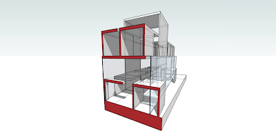
SketchUp Section Perspective
Illustrator Section Perspective
Posted by
k.nathe
at
8:32 PM
1 comments
![]()
Sunday, April 15, 2007
Sunday, April 8, 2007
Assigment 1 - Additive Approach
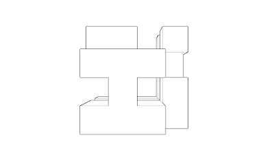
So in comparison to the Subtractive Approach, I personally thought there was a bit more freedom with this method in some sense, although I know you can end up with the same product easily. The basis for this model was to create a large, hollow center with one main beam running through it. I constructed it primarily with 8' increments and used 4' ones to datum out the upper part of the hollow core as shown in the immersion views. I still used some symmetry as exemplified by the first elevation and the rest I left to varying, creating or seperating different spaces on both the interior and exterior of the whole.
Isometric View
Elevation 1
Elevation 2
Immersion View 1
Immersion View 2
Posted by
k.nathe
at
11:24 PM
0
comments
![]()
Saturday, April 7, 2007
Assignment 1 - Subtractive Approach
After starting off with the solid 32' by 32' cube, I chose to immmediately create my vertical and horizontal spaces, interconnecting them with one another. As for the core of the model, I wanted to hollow it out and give a gradual recession into a cave-like space as shown in second immersion view. For the facades, I created bilaterally symmetrical symbols and figures on four of the cube's sides. Others, I designed accordingly to make either light or heavy impressions, one of the heavier obviously making up the foundation. I chose to do the perspective elevations to show the depth and a better understanding of the faces.
Isometric View 
Elevation 1
Elevation 2 
Immersion View 1
Immersion View 2
Posted by
k.nathe
at
9:14 PM
0
comments
![]()


