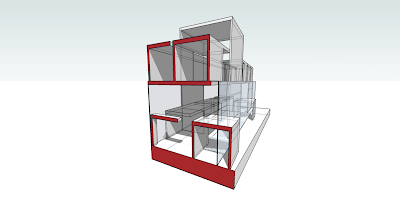
Section Perspective w/ Entourage Figures
Interior Immersive Perspective w/ Entourage
Note - The first set posted is with purely SketchUp figures, whereas this set of posts incorporates both SketchUp's and a few of those posted on the ARCH 222 Zoo Server File.
Sunday, April 29, 2007
Assignment 4 - Entourage Inclusive (Update from ARCH 222 Zoo)
Posted by
k.nathe
at
4:00 PM
0
comments
![]()
Friday, April 27, 2007
Sunday, April 22, 2007
Assignment 3 - Focus on Section Perspective
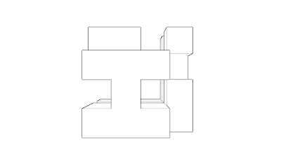
Plan View
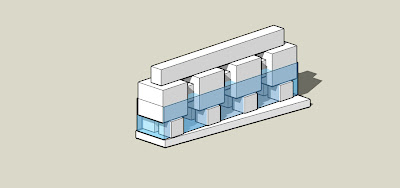
Elevation View
Immersive Interior Perspectives with a Focal Length of 24mm 
Immersive Interior Two- Point Perspective with a Focal Length of 24mm
SketchUp Section Perspective
Illustrator Section Perspective
Posted by
k.nathe
at
8:32 PM
1 comments
![]()
Sunday, April 15, 2007
Sunday, April 8, 2007
Assigment 1 - Additive Approach
So in comparison to the Subtractive Approach, I personally thought there was a bit more freedom with this method in some sense, although I know you can end up with the same product easily. The basis for this model was to create a large, hollow center with one main beam running through it. I constructed it primarily with 8' increments and used 4' ones to datum out the upper part of the hollow core as shown in the immersion views. I still used some symmetry as exemplified by the first elevation and the rest I left to varying, creating or seperating different spaces on both the interior and exterior of the whole.
Isometric View
Elevation 1
Elevation 2
Immersion View 1
Immersion View 2
Posted by
k.nathe
at
11:24 PM
0
comments
![]()
Saturday, April 7, 2007
Assignment 1 - Subtractive Approach
After starting off with the solid 32' by 32' cube, I chose to immmediately create my vertical and horizontal spaces, interconnecting them with one another. As for the core of the model, I wanted to hollow it out and give a gradual recession into a cave-like space as shown in second immersion view. For the facades, I created bilaterally symmetrical symbols and figures on four of the cube's sides. Others, I designed accordingly to make either light or heavy impressions, one of the heavier obviously making up the foundation. I chose to do the perspective elevations to show the depth and a better understanding of the faces.
Isometric View 
Elevation 1
Elevation 2 
Immersion View 1
Immersion View 2
Posted by
k.nathe
at
9:14 PM
0
comments
![]()


